
In Finance, Humans Were the First Machines
A Q&A with Chicago Booth’s Dacheng Xiu on the implications of machine learning for the financial markets.
In Finance, Humans Were the First Machines
If you’re seeking insight into the inclinations of investors, there is much to be learned from the data that document their every move. We encounter quite a lot of data here at Chicago Booth Review, from the timing of investors’ trades to the currencies in their portfolios to abnormal increases in late-night taxi rides around New York’s financial district. Our Fall 2018 issue features about 20 charts and infographics to help tell the stories encapsulated in these data. Here is a selection of some of our favorites.
A study of data from millions of taxi rides—focusing on key dates around Federal Open Market Committee meetings—finds an increase in potential face-to-face meetings between insiders from the New York Fed and Manhattan’s financial sector. Here we use a combination of charting styles to build a timetable that shows around-the-clock taxi activity in the days before and after Fed meeting announcements over the course of several years. The resulting visualization offers a clear look at exactly which time slots had a significant increase in taxi rides compared with other dates.
Taxi rides going from commercial banks to the Fed
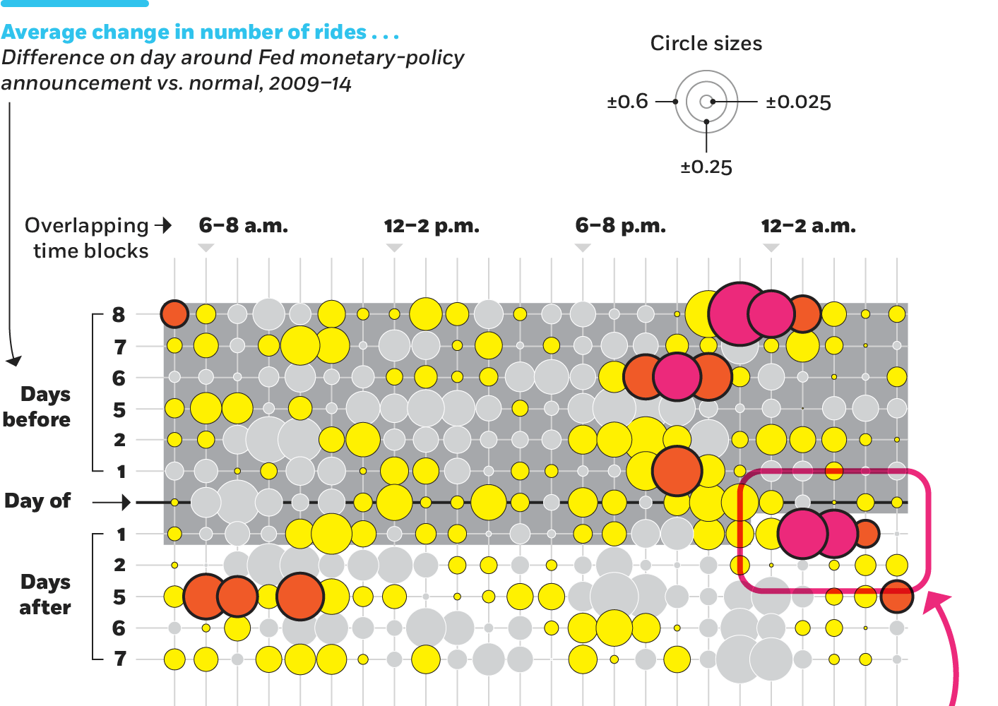
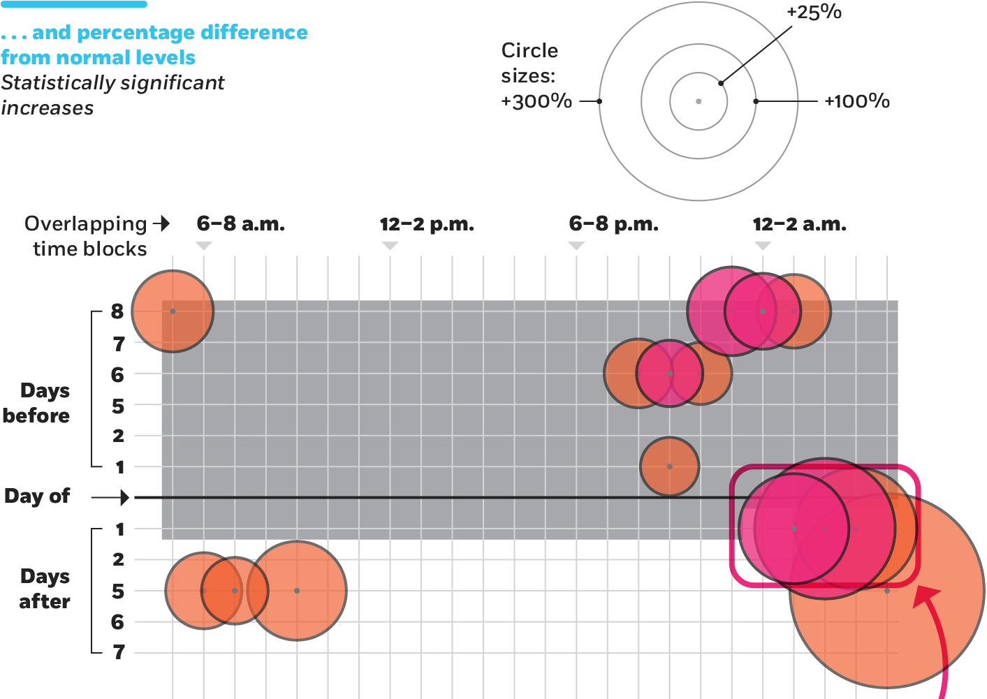
How to read these charts
A surge after the Fed’s communication blackout was lifted: On the night following the day after a Fed policy announcement, there were 0.38 more taxi rides than normal from 1 to 3 a.m. and 0.35 more rides from 2 to 4 a.m., or 94% and 154% greater than normal for those times, respectively.
Investors don’t need to hop in a cab to use Fed announcements to their advantage, however. Research finds that US markets move in potentially predictable patterns around monetary-policy surprises, such as the announcement of a federal funds rate hike beyond what investors were expecting. This line chart suggests that a short-term strategy of timing trades after such Fed announcements could reduce an investor’s risk. Also, market movement in the days before the announcements reveals that some investors seem to know the nature of these “surprises” in advance.
Cumulative market returns on days before/after Federal Open Market Committee policy announcements
CRSP value-weighted index of US stocks, daily closes (1994–2009)
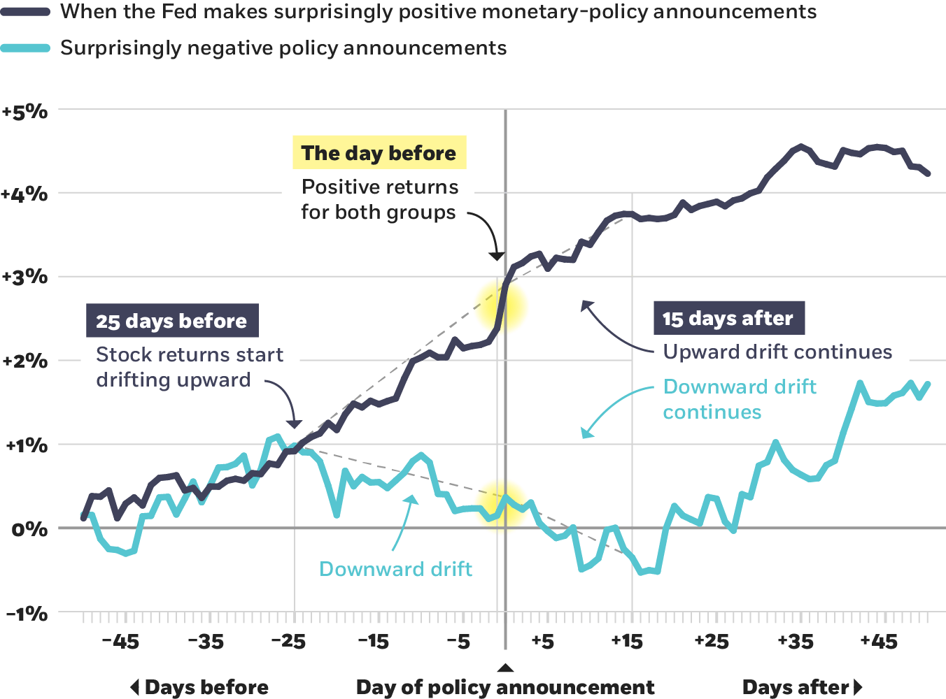
Neuhierl and Weber, 2018
Bond investors around the world strongly prefer to buy assets in their own currency, which can guide companies looking to issue securities outside their home country, according to research. The exception is the US dollar, which maintains a strong presence in international portfolios. These charts, with two different visualizations of the same data, illustrate the increasing international prominence of the dollar, which has gained considerable ground on the euro since the global financial crisis.
Our inaugural Business Practice survey posed the question: How would you respond during a salary negotiation for a new job if you were asked, “How much are you making now?” In the scenario, we asked people to imagine they earned $105,000 at their current company and were negotiating compensation for a position that would pay anywhere from $115,000 to $160,000. Here we chart the performance of the liars—the survey participants who included a salary figure in their answer that was higher than the amount in the scenario. When scored by other survey participants, these responses rated lower than those that surrendered the true $105,000 salary.
A Q&A with Chicago Booth’s Dacheng Xiu on the implications of machine learning for the financial markets.
In Finance, Humans Were the First Machines
Venture capitalists tend to rely too heavily on founders’ backgrounds.
How Startup Investors Could Back More Winners
Economists consider the roots and possible consequences of crypto’s ups and downs.
Is Crypto’s Volatility Bad for the Financial System?Your Privacy
We want to demonstrate our commitment to your privacy. Please review Chicago Booth's privacy notice, which provides information explaining how and why we collect particular information when you visit our website.