
Why Your Banking App Might Spell Trouble for Your Bank
‘Bank walks,’ not just runs, may undermine financial stability.
Why Your Banking App Might Spell Trouble for Your Bank
Sometimes, data can be illustrated with the help of something as simple as a slice of pizza. Other times, the figures underlying research are less easily digested. For the roughly 30 pieces of data visualization that went into the Summer 2017 issue of Chicago Booth Review, we tried to make each data set and concept, from the simplest to the most complex, accessible and compelling. Nonetheless, a handful stand out.
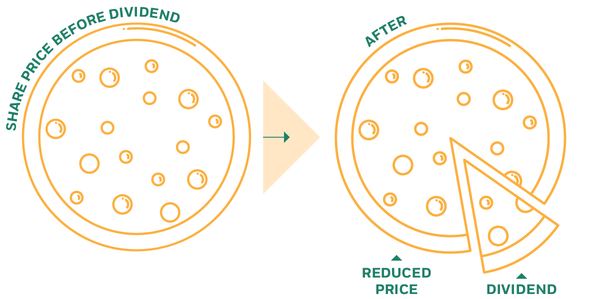
Chicago Booth’s Samuel Hartzmark and University of Southern California’s David H. Solomon explore the “free-dividends fallacy,” the notion that investors seemingly fail to recognize that a dividend comes with a corresponding drop in the share price of a stock. Investors instead see the dividend as a separate income stream. The research suggests that investors are eager to buy dividend-paying stocks and reluctant to sell them.
The Fed’s influence over interest rates is stronger in the short run but weaker as rates extend to months or years, according to research by Chicago Booth’s Eugene F. Fama. The charts here show the rates at different lengths of time—from one month to 10 years—as a spread over the fed funds target rate. Putting every chart on the same scale tells the story: in the short run, the spread is not especially volatile, but in the long run, it is much more so.
Fed influence wanes over the long term
The commercial paper rate stays fairly close to the fed funds target rate. But once rates extend to months, as with Treasury bills, or years, as with government bonds, the Fed’s target rate holds less sway.
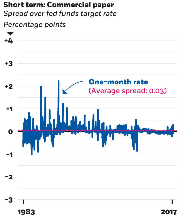
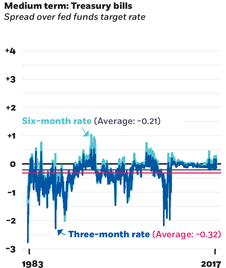
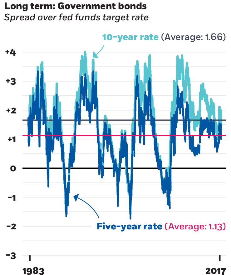
Fama, 2013; Federal Reserve Economic Database
Chicago Booth’s Pradeep K. Chintagunta uses data from Twitter to paint a picture of consumer sentiment about household-appliance brands such as Kenmore, Maytag, and Whirlpool. Plotting the information onto a grid creates a data-driven illustration of the degree to which people associate certain keywords with each of these brands.
Economic researchers marvel at what they have termed the Presidential Puzzle—going back to the 1920s, average stock market returns under Democratic presidents have been markedly higher than under Republican ones. This chart, based on research by Chicago Booth’s Lubos Pastor and Pietro Veronesi, looks at returns compared with the 3-month Treasury bill rate. The researchers suggest that voters’ economic risk aversion plays a significant role in determining which party wins the presidency.
Chicago Booth’s Waverly Deutsch looks at evidence supporting the idea that entrepreneurs find a strong foothold if they start a company after a market downturn. She focuses on US start-ups launched in 2011—after the 2007–10 financial crisis had led to a high number of company failures—and identifies numerous industries with strong five-year survival rates.
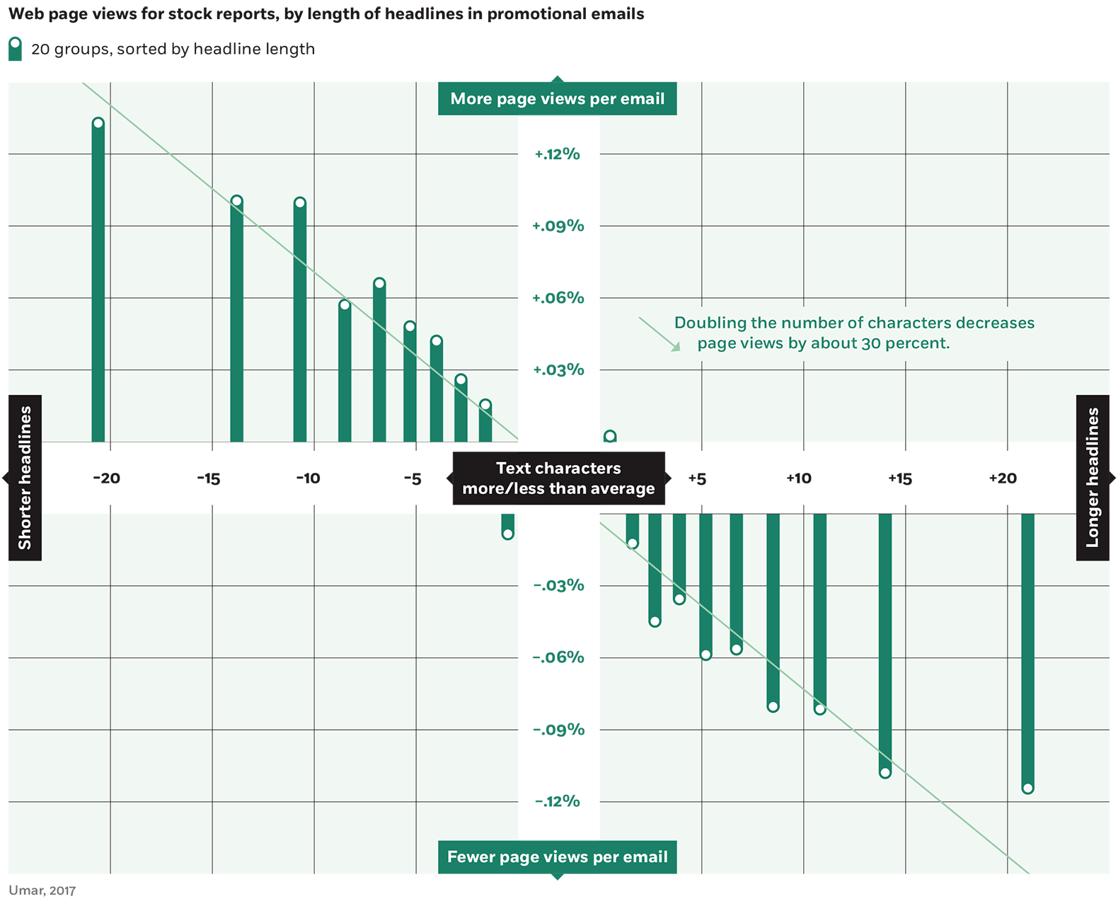
Less is more when it comes to the length of headlines, according to research by Chicago Booth PhD candidate Tarik Umar. Using email alerts from a popular website for investors, the research suggests that the shortest headlines get the most clicks, and longer headlines produce diminishing results
‘Bank walks,’ not just runs, may undermine financial stability.
Why Your Banking App Might Spell Trouble for Your Bank
The largest institutions have increasingly favored green stocks in recent years as small investors have done the opposite.
Big Finance Is Going Green. Smaller Finance, Not So Much
Attitudes and expectations about remote work have shifted globally.
Infographic: How the WFH Picture Varies around the WorldYour Privacy
We want to demonstrate our commitment to your privacy. Please review Chicago Booth's privacy notice, which provides information explaining how and why we collect particular information when you visit our website.