If you read a lot of the business press, you hear about how everything is just moving faster than we’ve ever seen it before. Technology is changing the pace of business, we’re told, enabling companies to act and react faster than ever. Every magazine, blog, and Twitter feed since 2012 has been warning that robots are coming for our jobs. To quote my fellow North Dakotan, cultural commentator Chuck Klosterman, “Everyone knows that the Internet is changing our lives, mostly because someone in the media has uttered that exact phrase every single day since 1993.”

If you think about your own daily life, you can find a lot of plausibility for the notion that things are speeding up. After all, how often do you use a search engine such as Google—which is much more now than just a search engine, but also an atlas, a shopping mall, a library, and a suite of office software, among other things? How often do you use social networks such as Facebook and Snapchat? How often do you use Grubhub or Amazon to perform transactions faster and more conveniently?

Recommended Reading

You can ponder all the time you spend on these things, and all the great things they do for you that you couldn’t do 20 years ago, and easily conclude that business is speeding up. But if you look at the American economy, things aren’t speeding up for one important measure: productivity growth. In fact, by historical standards, productivity growth is pretty slow.

You can think of all productivity measures as ratios of output to input. The most common one you hear about is labor productivity, or output per worker hour. This is the one that economists have been following the longest, and we have good confidence that we measure it as well as we can. It’s also where technological progress ought to show up: these new technologies ought to let us make great new things without having to put new resources into the production of those things.

Making better things using the same amount of resources, or making the same things using fewer resources, is, in the end, where economic growth comes from. If this phenomenon is taking place, you should see it in the data reflected as productivity growth. The problem is, if you go look for it in the United States, you don’t find it. Productivity growth hasn’t stopped altogether, but since the mid-2000s, the rate of growth has fallen considerably. Since then, the US has been averaging about 1.2 percent growth per year in productivity, but to understand that number, we need some historical context.

A brief history of productivity

There have been four periods of broad productivity growth trends since the end of World War II. We had a period of brisk labor-productivity growth in the first 25 postwar years, averaging 2.7 percent per year. In other words, for a quarter of a century, the value of production of every worker hour rose 2.7 percent per year. That means, in a sense, free stuff: every year, we got 2.7 percent more things out of the same worker inputs than we got the year before.

Then there was a slowdown for 20 years, from 1974 to 1994, when productivity growth fell to 1.5 percent per year. This was a period that included the rise of the personal computer and the integration of new technologies in a number of industries, and as is the case today, people were wondering why productivity growth slowed down. In the late 1980s, MIT’s Robert Solow famously said, “I see computers everywhere, except in the productivity statistics.”

Eventually, we did see the computers in the productivity statistics. Around the mid-1990s, productivity accelerated again, up to about 3 percent per year. It stayed there for a decade before slowing down again. It hasn’t yet picked back up.

The productivity slowdown is indeed widespread: it’s occurring in 29 of 30 countries in the Organisation for Economic Co-operation and Development.

So the 1.2 percent average annual productivity growth we’ve been experiencing since the mid-2000s is less than half of what it was in the decade prior, and is slower even than the 20-year slowdown from 1974 to 1994. Despite what seem like incredibly rapid changes in technology, we don’t see technologically driven growth in the data, and in fact we see the opposite pattern. Since economic growth requires productivity growth, if we don’t figure out why this is happening and how to fix it, we won’t get sustained increases in GDP per capita.

The slowdown I’m describing might sound small: 1 percent or 1.5 percent per year doesn’t seem like much. But if you compound that over multiple years, it really adds up. Suppose the slowdown after 2004 hadn’t happened, and we kept going with the same average productivity growth that we saw from 1995 to 2004. That would mean GDP in 2017 would have been, conservatively speaking, $3 trillion higher than it was. That’s $9,200 per capita.

That’s roughly $9,000 for every one of us, or $24,000 per household, that we do not have because productivity growth slowed down. Just a decadelong slowdown of 1.5 percent per year adds up to real money. If it continues for another 10 years, we will be missing a third of potential economic growth. In other words, GDP would be two-thirds of what it would be otherwise. You’re talking about real differences in people’s standard of living.

What’s causing the slowdown?

So it’s reasonable to ask, how can we have these great new technologies, yet they’re not showing up in the productivity statistics? One answer is that maybe technology isn’t moving as fast as we think. If robots really were taking over our jobs, you should see output per worker go way up—we’d have fewer workers because robots would be making everything we were making before—but that’s not happening.

Some people have said, “OK, that’s not what’s really going on. What’s going on is we don’t measure output very well.” The idea is that what’s lagging is not technological progress, but our ability to measure it. New products or services aren’t being captured in the way we measure output, so productivity growth looks smaller than it really is.

It’s not an implausible argument. To measure GDP output, we look at total expenditures on all goods and services. But what do I spend when I take a picture on my phone? What do I spend when I go online and search on Google? Or while away a couple of hours on Facebook? I’m not paying anything. I’m presumably getting value from that good or service, but it’s not showing up in the data. So some people argue that if we could just measure the flow of fun people have, or the enjoyment they receive from these products and services, it wouldn’t show this slowdown that we see in the statistics.

I tested this theory, which I call the mismeasurement hypothesis, in a recent study. The premise of the study is that even if we can’t trust the productivity data, the mismeasurement hypothesis ought to have some implications about things we can measure, so let’s look at these things and see what they tell us. I did four analyses to look at the question in different ways, and each time, I found evidence that mismeasurement is not what’s behind the apparent slowdown in productivity growth.

Comparing growth across economies

First, let’s look at whether this slowdown has happened outside the US, and moreover, whether the size of slowdowns across economies is related to the importance of information technology–related goods. The mismeasurement hypothesis implies that countries where IT stuff is more important should have more mismeasurement, so we ought to see a bigger slowdown in these countries than in economies where tech is less important.

The productivity slowdown is indeed widespread: it’s occurring in 29 of 30 countries in the Organisation for Economic Co-operation and Development, which is basically made up of the wealthy economies of the world. If you compare average productivity growth in the period 1995–2004 to the period after 2004, in all but one of those 30 cases, productivity growth is slower in the latter period. Productivity growth has also slowed in most of the emerging economies of the world—such as China, Brazil, and Russia—though for these countries it started a bit later.

A scatterplot charting the share of households with broadband in O.E.C.D. countries, with percentages on the y-axis and the same labor-productivity growth scale as the last chart. The dots are clustered very similarly, mostly between twenty and eighty percent on the y-axis and between zero and negative three on the x-axis.

Syverson, 2017

Is the size of the slowdown related to the importance of IT goods in these economies? We can gauge that importance using both supply-side and demand-side measures. On the supply side, we can look at the share of the country’s GDP that is accounted for by production from IT-related industries. On the demand side, we can measure the importance of IT-related products using the broadband-penetration rate in the country in the mid- to late 2000s.

If we compare the size of each country’s slowdown to the importance of information-communication technologies in that country’s economy, as a share of total production, there is no relationship.

A scatterplot charting I.T. industries’ share of value added to O.E.C.D. countries’ G.D.P., with percentages on the y-axis, and the percentage point change in labor-productivity growth over the years of 2005 to 2015 compared with the years of 1995 to 2004. The dots are clustered between four and twelve percent on the y-axis, and between zero and negative four on the x-axis.

Syverson, 2017

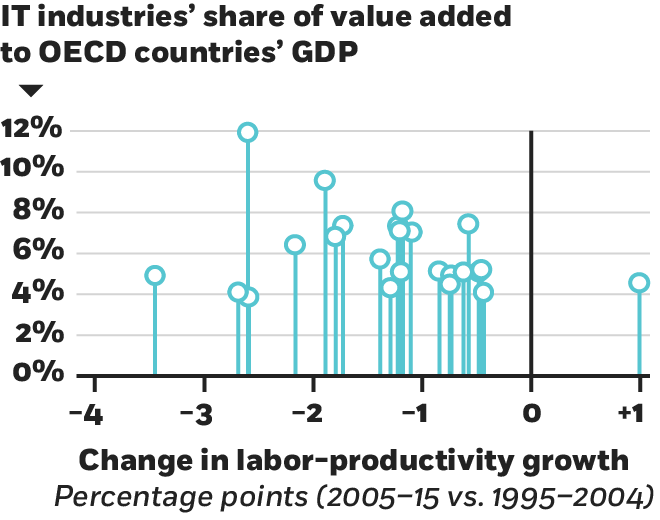
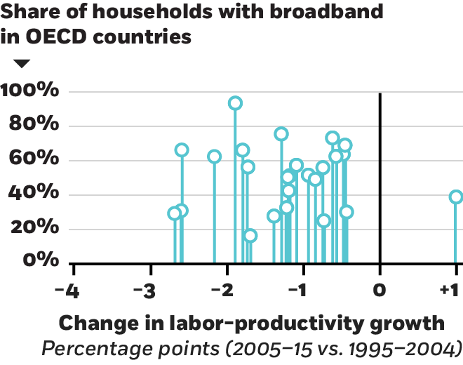
Similarly, if you compare each country’s productivity-growth slowdown to the fraction of households in that country with broadband access, the relationship is again zero.

There just does not seem to be any systematic relationship between the size of the slowdown of productivity growth and the importance of IT products in a country’s economy, which is a strike against the mismeasurement hypothesis.

Pricing IT

Next, let’s look at the work of other researchers who have said, “Well, we’ve got a way to get at, through the side door, what the value of these technological goods are.” We can take their methods, put in new data, and see whether we can get a feel for what the value of these IT-related goods might be. There are about a dozen or so carefully done studies that attempt to put a value on technological goods, so do any of them arrive at a value anywhere near $3 trillion?

In short, no. These studies typically produce figures in the neighborhood of $100 billion–$200 billion in the US. That’s not pocket change, but it’s nothing compared to the $3 trillion of output that is missing because productivity growth has slowed. The highest estimate comes from Chicago Booth’s Austan D. Goolsbee and Stanford’s Peter J. Klenow, who calculate that the total consumer valuation for these products might be in the neighborhood of $850 billion. That’s twice as large as the second-largest estimate, but still not even a third of the way to our missing $3 trillion. What’s more, the studies to which I’m referring are estimating the total surplus created by these products—this includes revenues, which are used to calculate GDP, but also consumer surplus, which isn’t.

Implications of mismeasurement

As a third analysis, let’s take the missing $3 trillion at face value and say, “OK, let’s suppose that $3 trillion really does exist, and we just missed it in our statistics.” What would that imply about what’s happened if we did measure it? Let’s wave our magic wand, say we’re not missing that $3 trillion anymore, and then ask ourselves whether we believe those numbers once we’ve added that $3 trillion back in.

According to what we can measure, IT-related industries in the US produced $1.4 trillion in total value added in 2015, the latest year for which data are available. That’s up from $800 billion (adjusted for inflation) in 2004, so we’ve had measured growth in the production of IT-related products in the neighborhood of $600 billion. Now, if we accept that these are the sectors from which this missing $3 trillion is coming, what we’re really saying is that $600 billion is just the tip of the iceberg. There’s another $3 trillion that was being produced but that we missed in our statistics, so the real number isn’t $600 billion, but rather $3.6 trillion.

So we can ask, “All right, do we find it plausible that we have basically captured one-sixth of the output that was actually created in these sectors?” Is our ability to measure output so poor that we actually only capture about 17 percent of the activity in these sectors? That’s the implication of the mismeasurement hypothesis.

Another implication is that productivity growth in these sectors was really astronomical. As measured, these industries experienced 80 percent labor-productivity growth. In 2015, a worker hour in these IT-related sectors created 80 percent more output than it did in 2004. That’s very rapid growth. But according to the mismeasurement hypothesis, it was actually much faster: 415 percent growth over that 10-year period. Is it plausible that these sectors really experienced this sort of growth, which would be an order of magnitude beyond anything we’ve ever seen in any sector over an extended period of time?

Another way to look at it is that $800 billion was about 8 percent of GDP when the productivity slowdown started. Three trillion dollars is 17 percent of GDP right now. So are we missing 17 percent of GDP from a sector that accounted for 8 percent of GDP when the slowdown started?

I don’t have empirical answers to any of these plausibility questions. But if nothing else, we can say that accepting the mismeasurement hypothesis would require us to swallow some striking figures.

The evidence of income

Finally, let’s look at income versus output. GDP is the total value of all expenditures in the economy. Gross domestic income is the income flip side of that. It’s the total amount of income in the economy. These two things, when you add everything up, should be equal to one another, because one person’s expenditure is another person’s income. But they never do in practice, because they’re measured using different data. The Bureau of Economic Analysis adds both measures up, and they’re close, but they’re never the same.

If you look at the gap between them, there’s actually a pattern to it. Since 2004, gross domestic income has been higher on average than GDP by about 0.5 percent per year. If you add up all those differences across the decade, the decade covering the productivity slowdown, it adds up to almost $1 trillion. In some sense we’re saying there’s $1 trillion of income that has been earned over the last decade that isn’t showing up in expenditures.

If productivity growth stays where it is, you should be worried. We are going to be considerably poorer than we would be otherwise. We already are.

People have said, “Well, actually, this gap is completely consistent with the mismeasurement hypothesis.” The story is that companies such as Google, Snapchat, and Facebook pay people really well to create stuff that the companies then go and give away for free. You see a lot of income, because the workers for these companies are getting paid, but you don’t see expenditures, because no one’s paying for Google when they use it, and that’s why you see this gap open up. That’s the story anyway.

The problem is, this gap did not open up at the time of the productivity-growth slowdown. It opened up in 1998, and in fact, it was positive for every single year between 1998 and 2004. The gap opened up not as we saw the rise of smartphones and social media; it already existed. Moreover, if you look at where the income growth has come from and why it’s separated itself from output, it’s come not from payments to labor, but payments to capital. In other words, profits are really high—precisely the opposite of what’s suggested by the mismeasurement hypothesis and the accompanying notion of high wages combined with low revenues.

In part, this is because companies such as Google, Snapchat, and Facebook aren’t just giving stuff away for free, of course. We may not pay directly for these services every time we use them, but it’s not right to say that there is no transaction that’s measured. For instance, all the companies that advertise to me on Google, and Facebook and Snapchat, pay Google, Facebook, and Snapchat for that advertising. This is being measured in GDP. Moreover, I can’t enjoy Google or Facebook, or use my GPS or camera, until I buy various devices, and I also can’t do any of that stuff until I get online by paying for broadband, wireless access, etc. All these transactions are part of GDP. It’s not at all clear that we’re not paying for any of this, or that we somehow don’t measure these payments.

All four of these analyses imply that the productivity-growth slowdown is real. To suggest otherwise due to mismeasurement, you’d have to argue not that our measurement of output is bad, but that it got systematically worse around 2004 or 2005, and worse in a particular direction. No one’s been able to suggest this has happened.

Be afraid—but don’t panic

So how worried should you be? If productivity growth stays where it is, you should be worried. We are going to be considerably poorer than we would be otherwise. We already are. Ten years into the slowdown, we’re each already $9,000 poorer per year.

But there’s reason to hope growth will pick back up. Looking back through the historical data, I see our current growth trend as an echo of past trends.

Historically, productivity gains from general-purpose technologies have come in waves. For instance, consider what I call the portable-power era—the time of the diffusion of technologies such as the electric motor and the internal-combustion engine. This era starts around 1890 and ends in the mid-1930s. For the first 25 years of this era, productivity growth was quite slow: less than 1.5 percent per year. Then starting around 1915, growth sped up to around 3 percent per year and stayed there for a decade. Then things slowed again through the mid-1930s. So you have a 25-year slow period while the technology was diffusing, a 10-year acceleration, and then another slowdown.

An echo of past productivity trends
An era starting around 1890, marked by the advent of the internal combustion engine and other technologies, saw periods of both quicker and slower productivity growth. A parallel can be seen in more current times.

A line chart plotting labor productivity as an index, with a y-index ranging from one hundred eighty to forty, and the years of 1890 to 2015 on the x-axis. One line tracks the portable power era that began in 1890 and sets its index value of one hundred to line up with labor productivity levels in 1915. It starts at about seventy-eight and rises to about one hundred seventy eight. A second line tracks the I.T. era that began in 1970 and sets its index value of one hundred to line up with productivity levels in 1995. It follows a remarkably similar trend, starting at about seventy and rising to about one hundred fifty-five.

Syverson, 2017

Let’s compare this to the more recent experience of the IT era, which began somewhere around 1970. Again, we had 25 years of slow productivity growth, a decadelong acceleration from 1995 to 2005, and then a slowdown. So the question is, what happened after that second slowdown in the portable-power era? Well, there was another acceleration, and productivity growth went back up toward 3 percent a year.

We’ve had one productivity growth wave for IT, from 1995 to 2004. We may yet have another. We may even have a third. That doesn’t mean we definitely will have one, or that it’s going to start tomorrow. But history tells us that the productivity benefits of new technologies can come in multiple waves. It’s almost inherent to the diffusion process of general-purpose technologies that you have retrenchment periods during which people need to figure out how to use those new technologies. The IT era is full of such technologies, such as artificial intelligence, that are just starting to find their place in commercial applications.

So take the productivity slowdown seriously, but don’t despair of the future. Keep your eye on the data, and better yet, make yourself and your own organization as productive as possible, and let’s all move the needle together if we can.

Chad Syverson is Eli B. and Harriet B. Williams Professor of Economics at Chicago Booth. This essay is adapted from a lecture given at the Initiative on Global Markets’ Myron Scholes Global Markets Forum in October 2017.

More from Chicago Booth Review

More from Chicago Booth

Your Privacy
We want to demonstrate our commitment to your privacy. Please review Chicago Booth's privacy notice, which provides information explaining how and why we collect particular information when you visit our website.